
The two main data types in business are nominal
The two main data types in business are nominal (categorical or qualitative data) and interval data (quantitative or continuous data). Nominal data are just categories on variables such as customer names, and marital status and you cannot do any mathematical operations on this type of data. Bar chart and Pie chart are usually used to describe nominal data. On the other hand, interval data hold numerical values on variables such as income, age, and invoice amount and you can do mathematical operations on them. Histograms are commonly used to describe interval data.
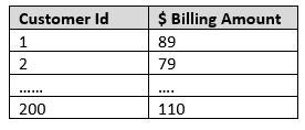
Given that classification is the fundamental step in management, a specific variable that holds interval data can be classified into different categories i.e. transformed into nominal data. For example, a telecom company like Bell can classify their customers into distinct groups based on the billing amounts (which is an interval data variable). Let’s say, Bell gets billing amount data of 200 customers in a specific geographic area as shown in the table. How can his data be categorized?
Sturges’s rule can help in determining the number of groups i.e. classifying the data in the interval data set.
Below are the key steps in classifying the interval data set or rather transforming the data from interval type to nominal type.
Step 1: Find the Range in the data set
Range = Max Value – Min Value = $129.63 – $10 (say) = 119.63
Step 2: Apply Sturges’s rule to determine the number of classes
# of Classes = 1 + 3.3 (log n); where n is the number of observations
# of Classes = 1 + 3.3 (log 200) = 1 + 3.3*2.3 = 8.5 = 8 groups (You can select 9 if you prefer)
Step 3: Determine the Class Width
Class Width = Range/Number of Class = 119.63/8 = 14.95 = 15 (rounded)
This means there will be 8 groups/classes which are separated by $15.
- Class 1 = $0 to $15 billing
- Class 2 = $16 to $30 billing
- Class 3 = $31 to $45 billing
- Class 4 = $46 to $60 billing
- Class 5 = $61 to $75 billing
- Class 6 = $76 to $90 billing
- Class 7 = $91 to $105billing
- Class 8 = $106 to $120 billing
Step 4: Use Excel to Plot the Histogram (and get the frequency of customers in each of the 8 classes)
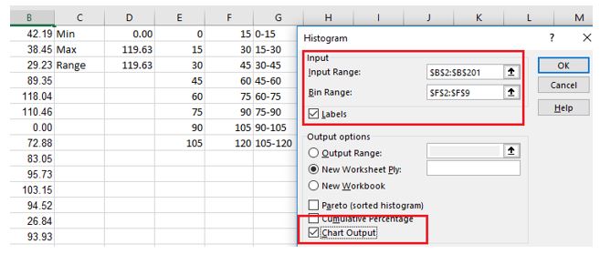
Make sure that you have the “Data Analysis Toolpak” downloaded in XL. Then go to Data –> Data Analysis – >Histogram.
Enter the data as shown.
The output (in a new tab) is as shown.
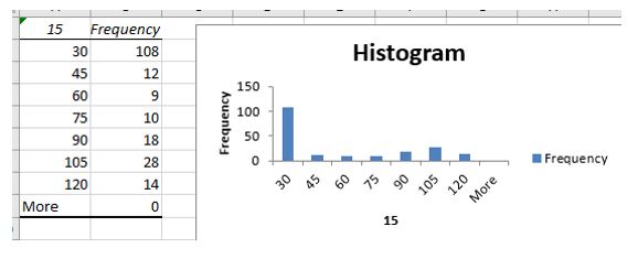
Step 5: Clean up the Table and the Histogram
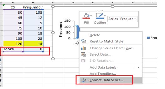
Make sure that you have selected the bar (in the Histogram) and click on “Format Data Series”. Then reduce the “Gap Width” from 150% (default) to 0%.
The final/clean Histogram with 8 groups is as shown.
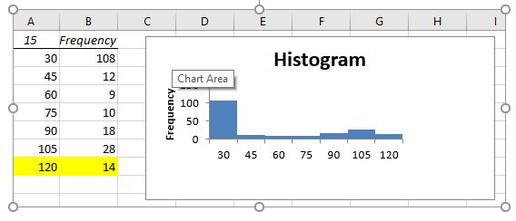
Now you have sub-divided your customers into 8 different homogenous classes based on billing amount and perhaps you can have promotional events specific for a group of customers; say the ones in class 1 (the group with maximum frequency/customers of the 8 classes).
Classification holds the key to good management. While you might be able to capture large amounts of time-series/continuous data, categorizing data is a fundamental building blocks for deriving insights and pursue appropriate actions.
